Zachary-Raup
Data Science Portfolio
Project maintained by ZRaup Hosted on GitHub Pages — Theme by mattgraham
Interactive Animation of Museum Visitor Paths and Hourly Room Traffic in Tableau
By: Zachary Raup
About the Project:
The goal of this project was to develop an interactive museum map that visualizes popular visitor paths and the average number of visitors in each room throughout the day. The animation begins at 8:00 AM when the museum opens and concludes at 9:00 PM. This visualization allows for a dynamic understanding of visitor flow and room occupancy at different times of the day, providing valuable insights into visitor behavior and space utilization.
The interactive animation allows users to hover over each room in the museum and see a guide that displays the visitor path, room name, hour of the day, and average number of visitors in the room for that hour. The size of the path line in the animation represents the number of people in that room. To maintain simplicity and clarity, only two paths are displayed in the visualization.
The project was undertaken as part of the ‘Data Visualization in Tableau’ course from Data Camp, where I applied advanced data visualization techniques to transform cleaned museum data into a meaningful and engaging interactive experience. By leveraging Tableau’s powerful features, I was able to create a comprehensive and user-friendly tool that highlights key patterns and trends in museum visitor behavior. This project not only demonstrates my proficiency in using Tableau for data visualization but also underscores the practical application of these skills in real-world scenarios.
Below are screenshots from the animation, which can be used to extract valuable insights.
Image 1: Crowded Cafe at 11 pm
This screenshot captures the occupancy in the Muesuem Cafe at 11 am, displaying an avaerage of 3,164 visitors per hour which was the most along Path A. The visualization highlights the distribution of visitors along path A and Path E within the Museum, where the size of the line correlates with the average number of people per room. Notably, the line is denser at the beginning of the museum’s path and gradually diminishes towards its end, indicating a higher influx of visitors entering the museum than exiting.
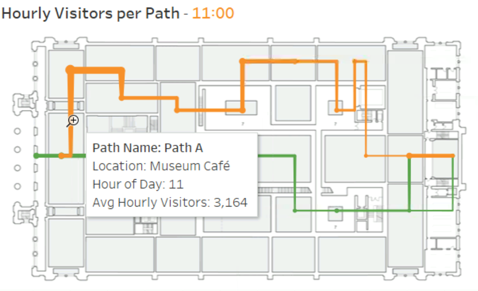
Image 2: Marc Lennox expo
Both Path A and Path E exhibit a significant concentration of visitors in the middle of the muesuem at 3 PM. Along Path E, the Marc Lennox expo registers an average of over 2,000 visitors at this time. Additionally, there is a notable gathering of visitors near the museum’s exit.
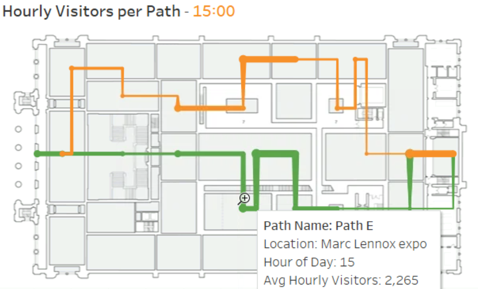
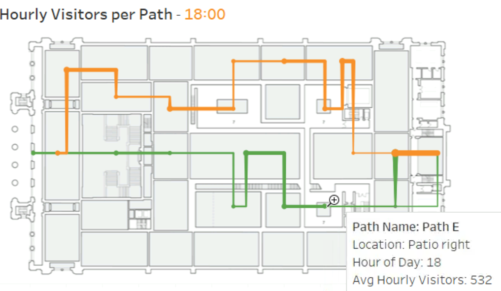
Image 3: Evening Visitor Trends in the Museum
At 6 PM, the animation reveals a lower average number of people in the museum compared to earlier hours. Despite the overall decline in visitor numbers, the highest concentration of visitors remains near the museum’s exit and in the central area.
Key Insights
Peak Visitor Hours:
-
The visualization clearly shows that the museum experiences peak visitor hours around midday, specifically at 11 AM. For instance, the Museum Cafe sees an average of 3,164 visitors per hour, indicating a high influx of visitors during this time.
-
This trend can help the museum plan for staffing and resource allocation, ensuring that there are enough staff members and amenities available during the busiest times.
Highly Visited Exhibits and Areas:
-
The Marc Lennox expo, as observed at 3 PM, attracts a significant number of visitors, with an average of over 2,000 visitors along Path E. This concentration suggests that the exhibit is a major draw for museum-goers.
-
Highlighting popular exhibits can inform marketing strategies, special events, and promotional efforts to further capitalize on these attractions.
Evening Visitor Trends:
-
The data indicates a noticeable decline in visitor numbers by 6 PM, with the highest concentration of visitors located near the museum’s exit and central area.
-
This suggests that visitors are wrapping up their tours and preparing to leave as closing time approaches. This insight can help the museum plan end-of-day activities, announcements, and services to ensure a smooth transition towards closing time.
By leveraging these insights, the museum can optimize operational strategies, enhance visitor experiences, and drive increased engagement through targeted improvements and strategic planning based on real visitor behavior data.
Conclusion
The interactive features of the animation, such as the ability to hover over rooms and see detailed information about visitor paths, room names, hours, and average visitor numbers, provide a rich, engaging way to understand visitor behavior. This comprehensive visualization enables museum administrators to gain a nuanced understanding of how visitors navigate the space, which exhibits draw the most attention, and which areas experience the highest traffic at different times of the day.
By leveraging these insights, museums can make informed decisions to enhance the overall visitor experience. For example, data showing peak visitor times can guide staffing schedules, ensuring adequate personnel during busy periods. Understanding which exhibits attract the most visitors can inform the development of new exhibits, marketing strategies, and promotional efforts, ensuring that popular exhibits receive the attention they deserve while underperforming areas receive targeted improvements.
Additionally, insights into visitor flow patterns can help in optimizing the museum layout, improving signage, and enhancing crowd management strategies to prevent congestion and ensure a smooth flow of visitors. The data-driven approach can also aid in planning end-of-day activities and services, ensuring a seamless transition towards closing time.
Overall, this project demonstrates the power of advanced data visualization techniques in transforming raw data into actionable insights. By applying these techniques, museums can continually refine and enhance their operations, ultimately leading to increased visitor engagement, satisfaction, and retention. This project not only showcases proficiency in using Tableau for data visualization but also highlights the practical application of these skills in a real-world setting, providing valuable tools for effective museum management.
Portfolio Links
Zachary’s Portfolio
Project 1: Discovering Similar Songs using Machine Learning and Spotify
Project 2: Regression Modeling | Walmart Sales Prediction
Project 3: Predicting Diabetes Using Machine Learning | Comparison of Classification Models
Project 4: Utilizing MCMC in Python to Explore the Parameter Space of an Exoplanet Transit
Project 5: Insights into Dog Behavior: Analyzing Dognition Data with MySQL
Project 6: Interactive Animation of Museum Visitor Paths and Hourly Room Traffic in Tableau